BusinessClass Digital
Collaborative Edtech project between Google and Sber aimed at developing small and medium-sized businesses in Russia.

Time
The project was launched at the end of 2020. I joined in September 2021 and worked on the project for 6 months.
Goal
To create a modern, easy to use and frictionless solution for those who want to bring up their businesses to new horizons throughout digitalization processes.
Metrics
Trained — 1 hour spent by the user on the site + viewing 7 content units (lesson, article, episode, webinar).

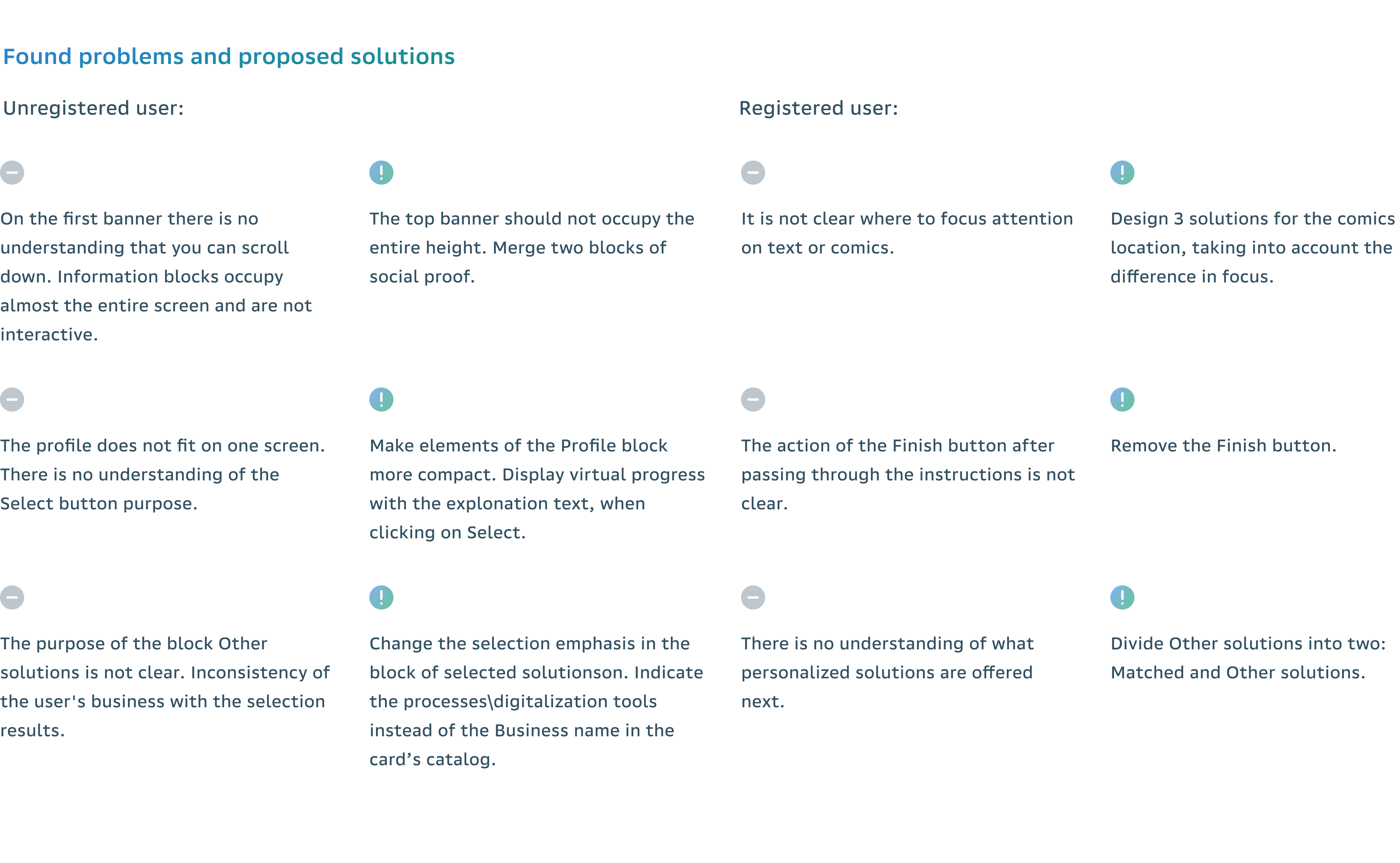
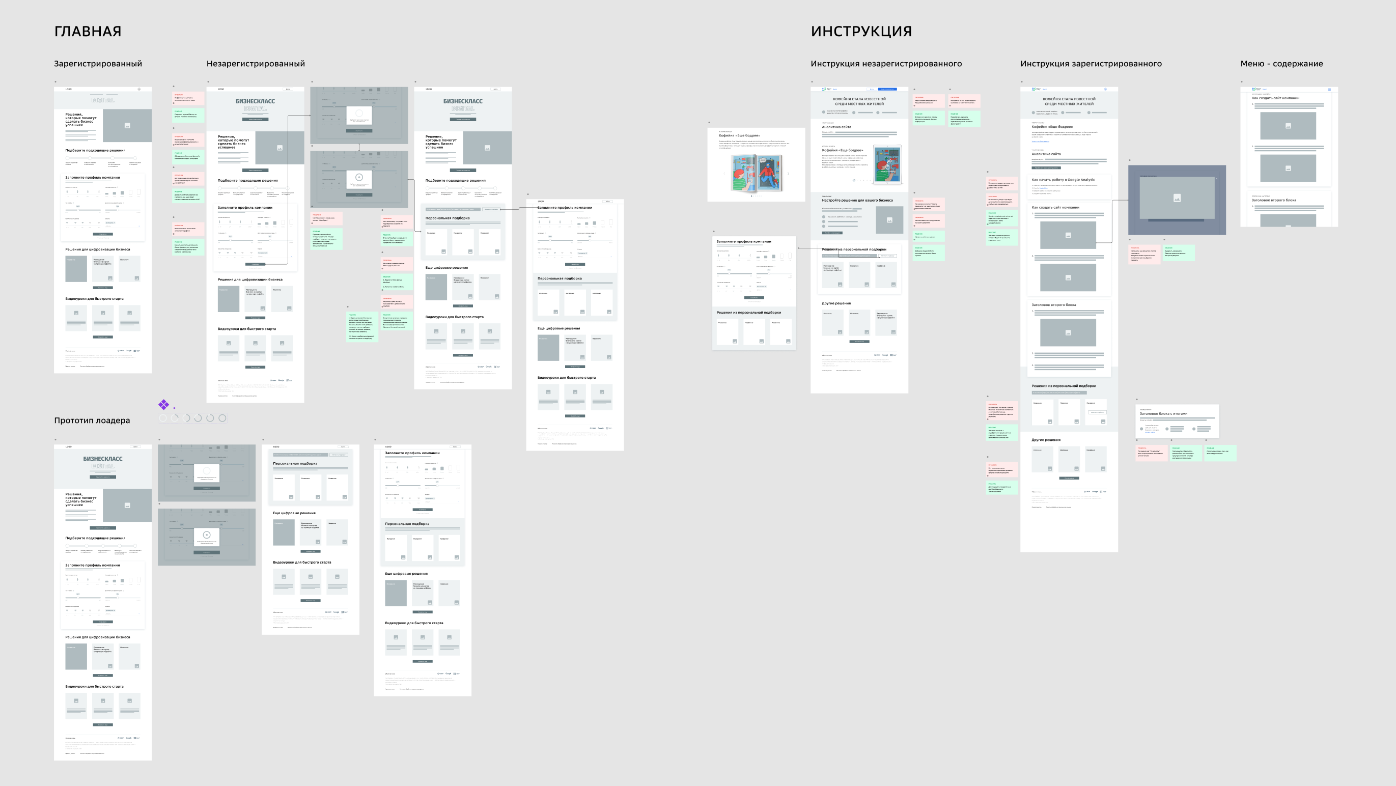
The main problem is that the visual design of the portal does not correspond to the topic of digital.

Target audience
On the basis of analytical data, a portrait of the target audience was drawn up. These are entrepreneurs, self-employed, start-ups, employees of companies, aged 25 to 42 years. Owning an operating small business or seeking to open one. Most audiences have heard of digital tools but have not used them before, or only used them to a limited extent for personal purposes.
Research
At the beginning, I conducted a competitive study of Russian and foreign platforms dealing with educational and training technologies.
Based on information about the target audience and identified patterns, I began to work out the design style. I came up with two design concepts. Presenting them to the customer, I explained in detail the idea of ​​each concept, giving examples of animations, the use of typography, colors, layouts.

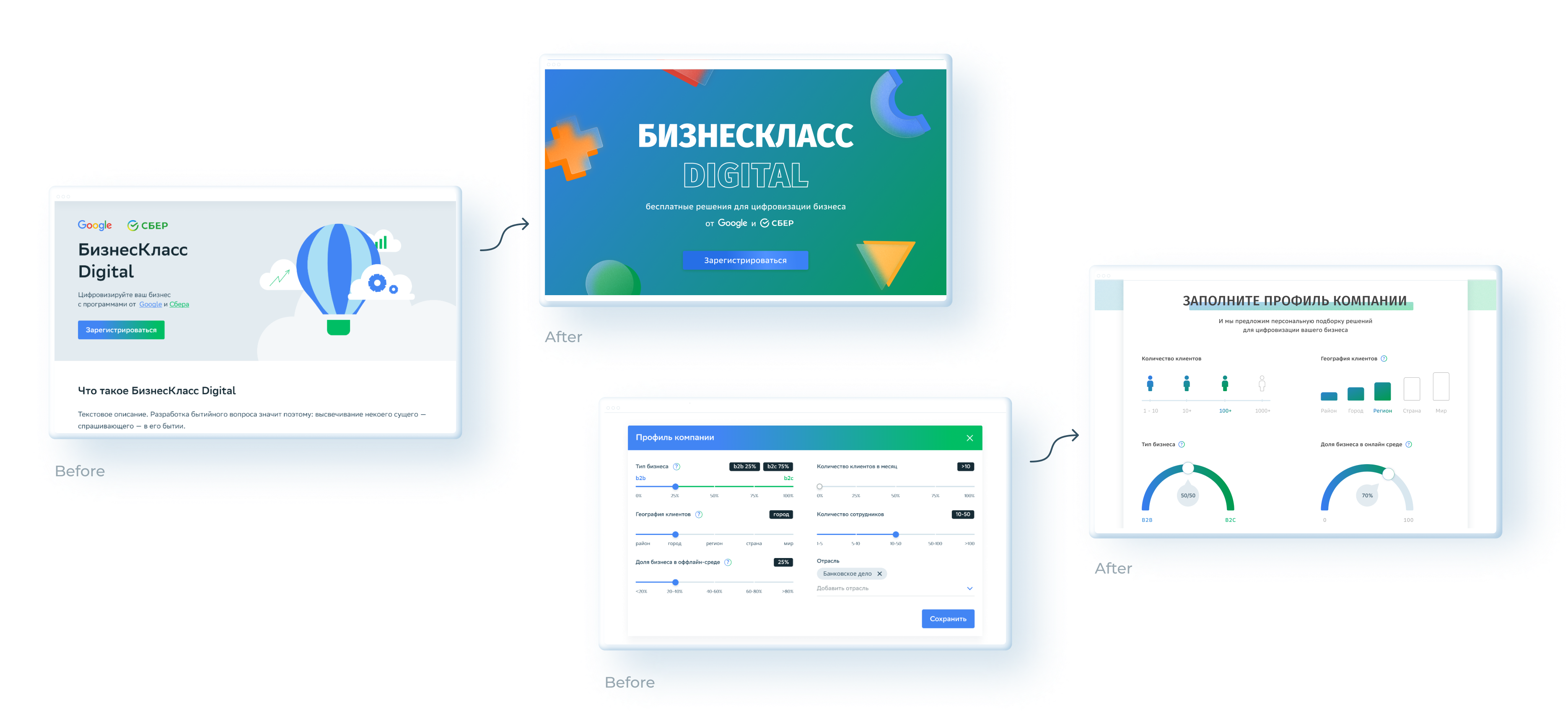
The design elements of each company were 
taken and combined as the basis for this concept.

Style formation
Google – simple shapes and bright colors; Sber – glassmorphism style elements, volume, glow, and gradient colors. BusinessClass Digital is a synergy of two companies Google 
and Sber.

The platform must perform its main functions and provide content to users. The design should not draw attention to itself and be intrusive, so the best option for these tasks is white color and free spaceIn this case, the design focuses on the details: the use of glass-effect shapes, accents with shadows, 
and gradients, which give the interface depth and dimension.
Sketch
After user and market research, style design approval and a couple of iterations based on the feedback of customer, sketches were created and the user path was drawn.

After three iterations,
the first version of the design was ready.

Usability test
In addition to basic competitive research and some qualitative/quantitative data, I, accompanied by a business analyst, a sales manager and a second designer, conducted interviews with 6 respondents, trying to remain impartial and as neutral as possible. We were itching to point out common pain points from quotes and translate them into clear goals. From usability sessions with clients, we learned some constructive human insights. Overall, they rated the ease of use and speed of content creation.
Tasks
Test the web and mobile version of the site, evaluate the success of the Task Completion Success Rate steps, find out if the client is ready to connect the services offered by the site.
Target
Evaluate the convenience of the interface and identify bottle necks in the target flow.

The overall success of the tasks is 94%,
which is a high result.
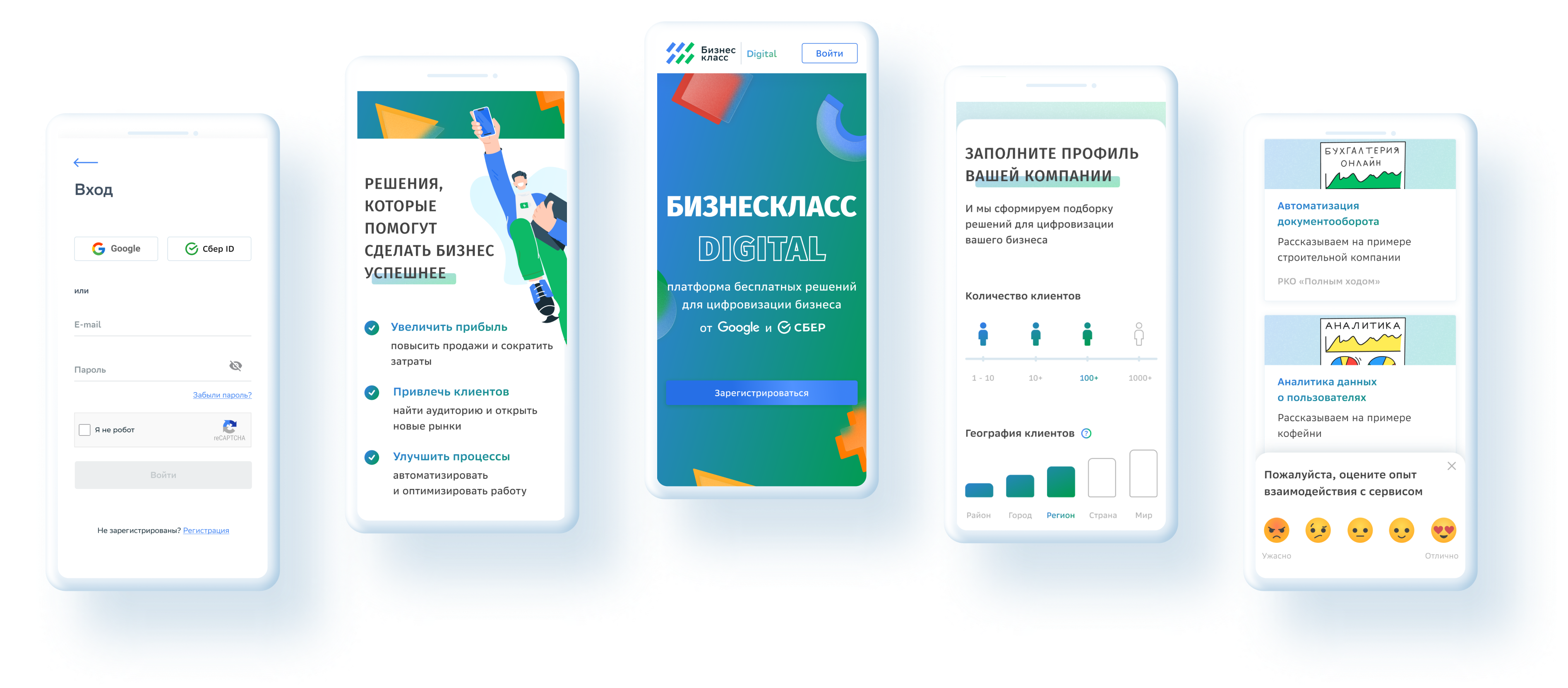
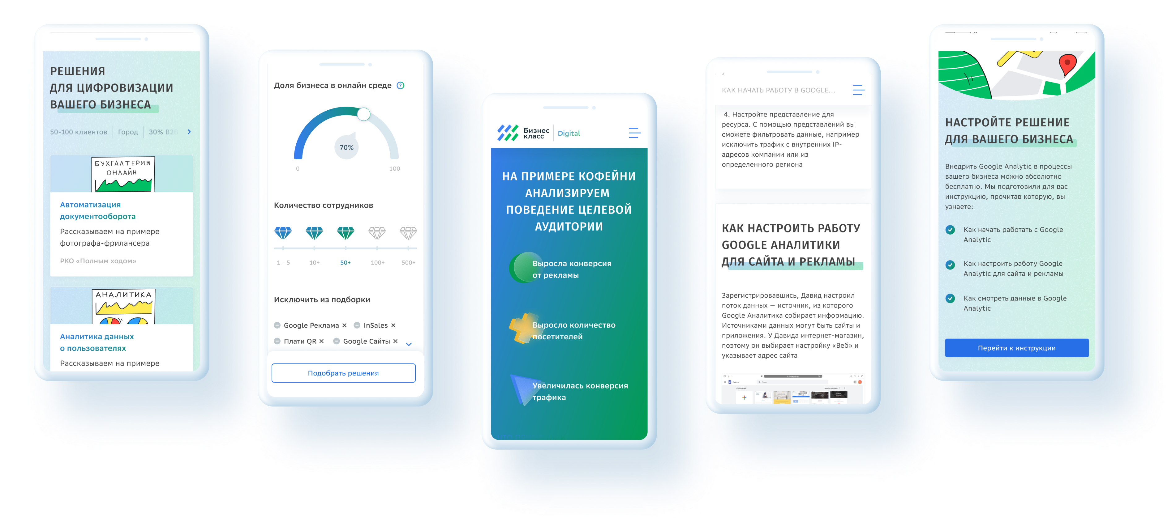
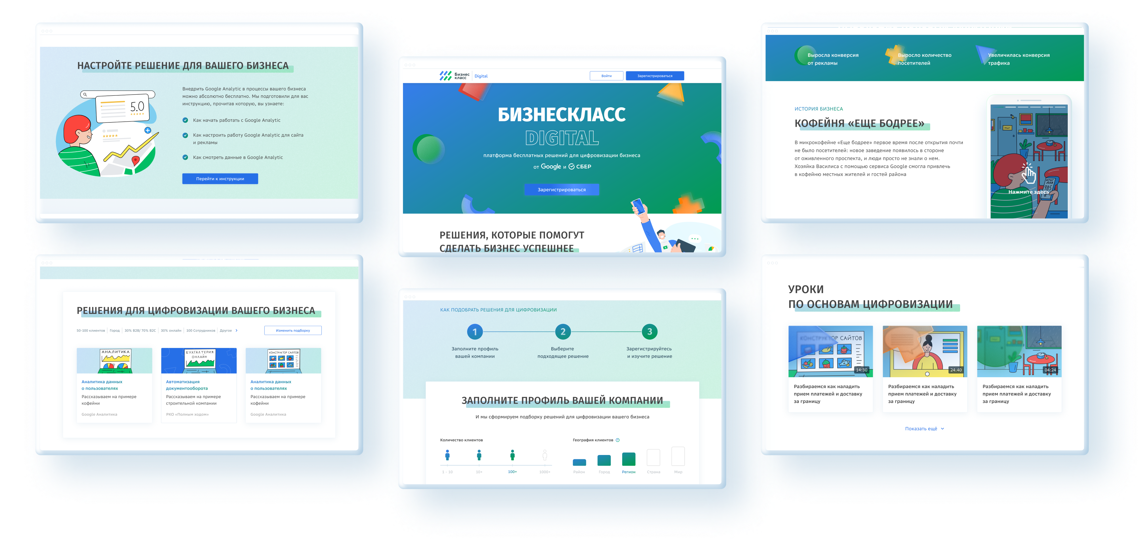
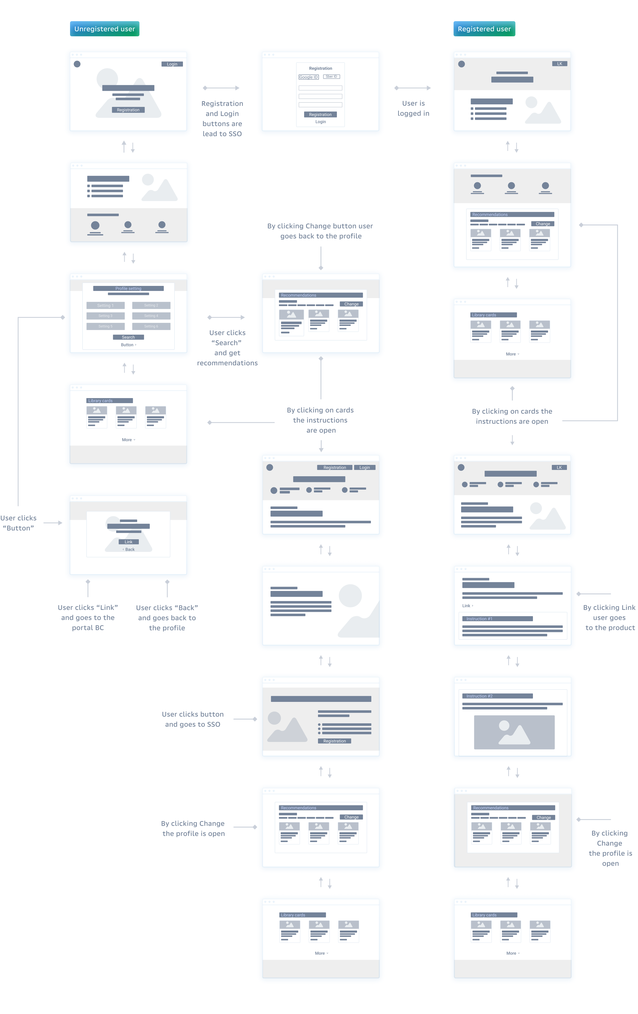
Wireframe
It all started as a wireframes to make sure that the information architecture is done correctly. The next step was to bring some life 
into it — and it resulted in a very modern, visually attractive 
and professional looking outcome.

Final solution.

Breakpoints
The final design was focused on good visual appeal and was adapted to all screen resolutions.

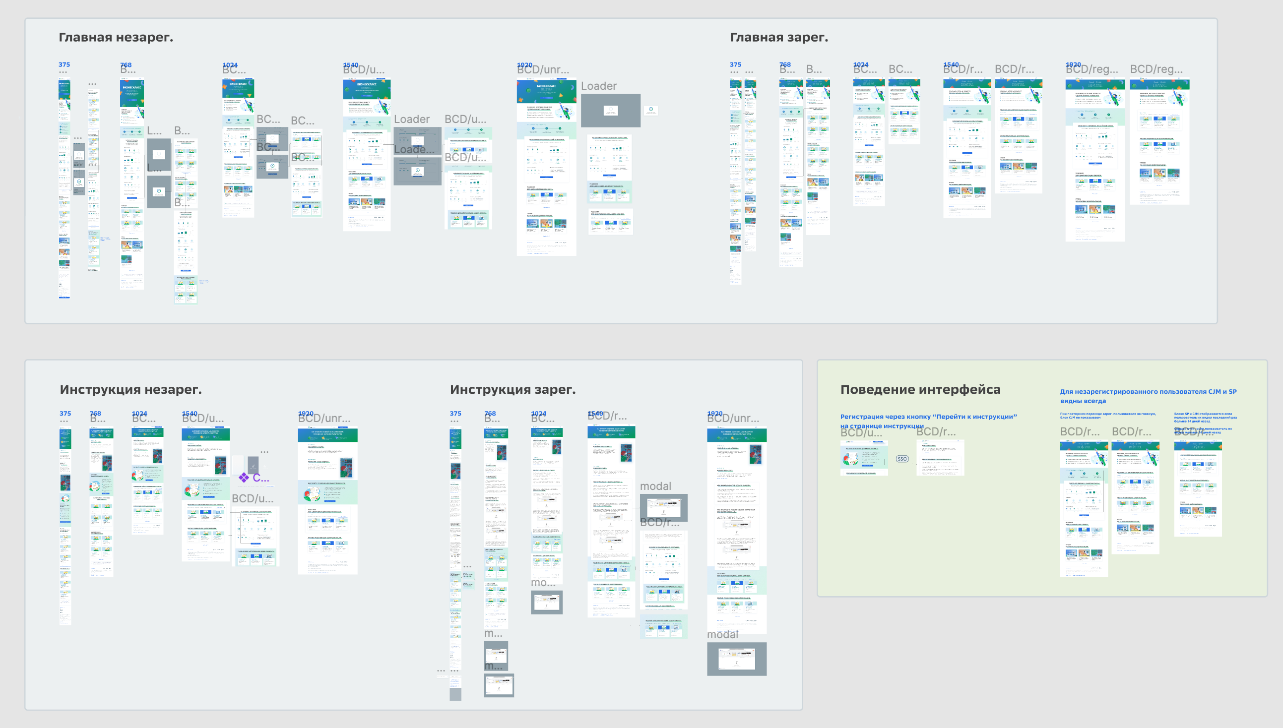
Actually the final product never exists, the platform would still probably need some more iterations, but it wasn’t planned, so this is the final version.